Bardank
Branding + identity project for an art directory based in Lebanon
00
Challenge
Although BARDANK’s expertise was indisputable, their visual identity lacked the subtle cultural nods and cohesive system needed to stand out in a crowded gallery of advisory firms. Their existing collateral and digital touchpoints felt disparate, missing an elegant thread to tie together portfolios, presentations and event invites.
solution
We distilled BARDANK’s curatorial ethos into a frame-inspired logo that both honours the Arabic letter “ب” and signals their role as guardians of artistic value. A refined palette of deep black, soft grey and aqua accents set the stage for clarity and contrast. From bespoke business cards and event posters to digital templates and bespoke patterns, we created a flexible suite of brand assets and collateral that ensures every touchpoint feels considered, contemporary and unmistakably BARDANK.
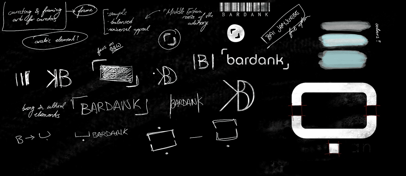
BARDANK is a Beirut-born art advisory, dedicated to guiding collectors through every step of building and preserving fine-art collections. From sourcing gallery-ready pieces to staging exclusive exhibitions, they sit at the intersection of Middle Eastern heritage and global art markets, framing every encounter with purpose and precision.
Today, BARDANK greets clients with a confident, unified brand that mirrors their meticulous approach to art. Their new identity effortlessly adapts from printed investor decks to online galleries, reinforcing their promise to curate, frame and celebrate art in all its forms - wherever collectors and creators may be.
01

02

see also


