Gaby's Bagels
Start-to-finish naming and branding for a freshly minted bagel shop in the heart of Madrid
00
Challenge
Starting from a blank slate, Gaby brought only a dream: to share her love of bagels with Madrid. She needed a name that felt personal, a brand voice bursting with charm, a visual identity that could stand out on crowded streets, and packaging that turned a simple takeaway into a memorable moment.
solution
When Gaby’s Bagels opened its doors, it arrived fully formed: a recognisable brand that turns heads, packaging that delights even before the first bite, and a clear set of guidelines to keep every customer interaction on point. The result is a café that doesn’t just serve bagels, it serves an experience, leaving Madrid’s morning rush just a little bit sweeter.
Gaby’s Bagels is a freshly minted bagel shop in the heart of Madrid, marrying the hearty tradition of New York–style bagels with cosy Spanish café culture. From hand-rolled dough to perfectly toasted sesame, every bagel is crafted with care and served alongside matcha, coffee and a warm smile, inviting busy Madrileños to slow down and savour the little pleasures in life.
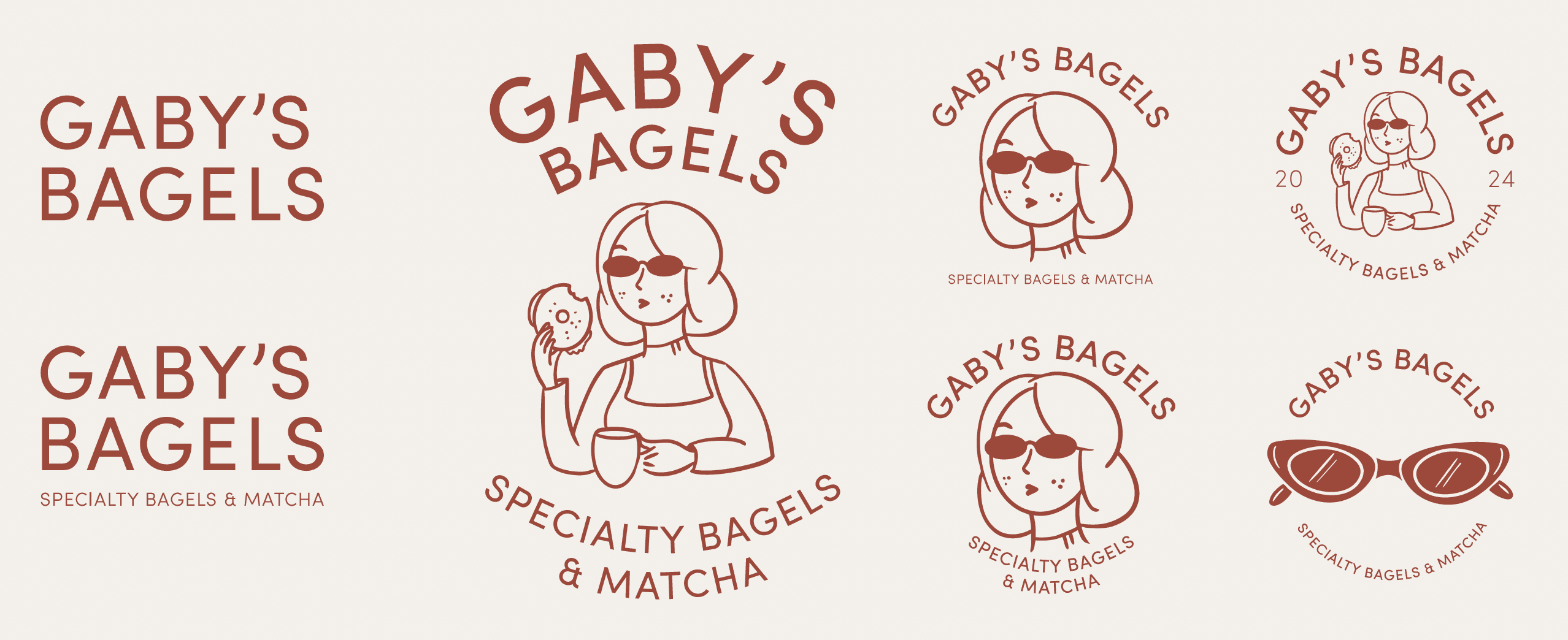
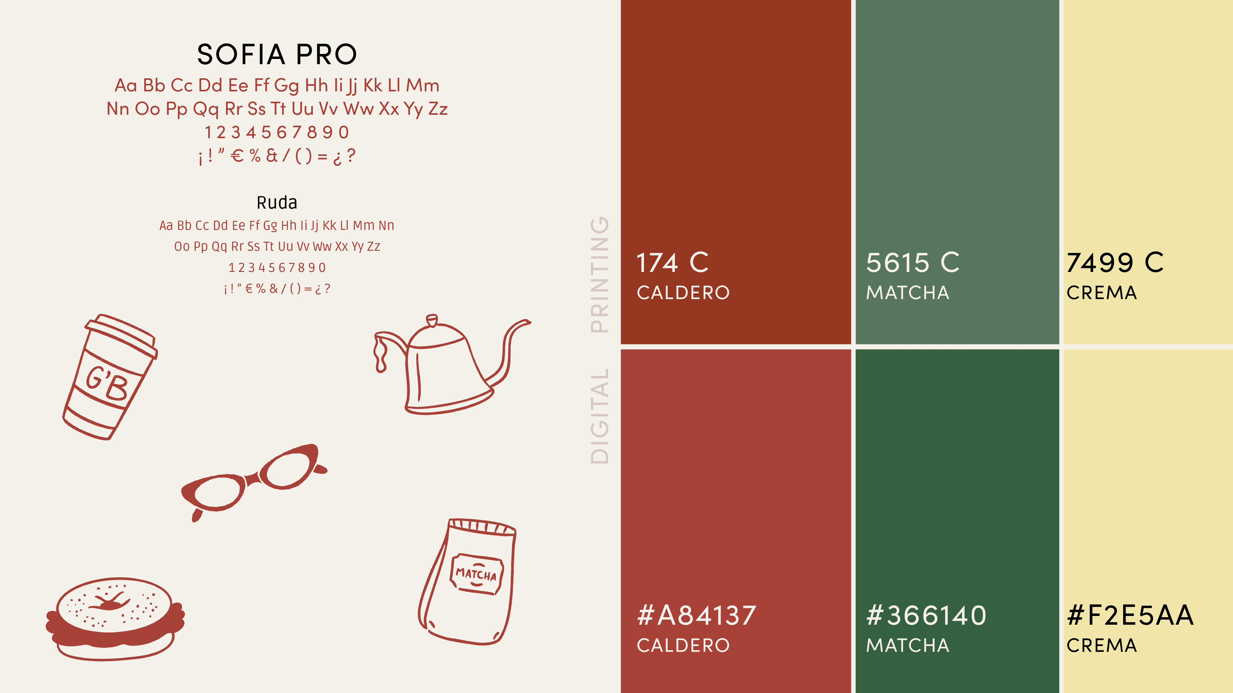
We kicked off with a naming workshop, landing on Gaby’s Bagels, simple and personal. Next, we defined a brand strategy around three pillars: approachability, craft and delight. That guided tone of voice (“witty, playful and full of flavour”) and messaging . Our design team then sculpted a vibrant identity: a logo family, a distinctive colour palette of warm red, deep green and soft cream, plus a duo of typefaces (Sofia Pro and Ruda) that balance friendliness with clarity. Finally, we wrapped it all up in packaging and collateral (from branded cups, bags and napkins to in-shop signage) ensuring every touchpoint feels unmistakably Gaby’s.
01

02

03

see also


